Explore innovative bed colour design ideas that can seamlessly integrate with your interior decor. This guide will help you choose the perfect hues to enhance your bedroom’s aesthetic appeal. Selecting the right colour for your bed can transform your space, creating a cohesive and inviting atmosphere. Let’s dive into some exciting ideas that can elevate your bedroom design.
The Psychology of Bed Colours
Understanding how colours affect mood can significantly influence your choice of bed colour. For instance, blue is known for its calming effects, making it ideal for a peaceful bedroom. In contrast, red can evoke passion and energy, suitable for a more vibrant space. By recognizing the emotional impact of various hues, you can create an environment that aligns with your desired mood.
Trendy Bed Colour Palettes for 2023
- Soft Pastels: Gentle shades of pink, mint, and lavender are trending this year, offering a fresh and airy feel.
- Earthy Tones: Rich browns, terracotta, and olive greens provide a grounded, natural vibe.
- Bold Jewel Tones: Deep sapphire, ruby, and emerald can add a luxurious touch to your bedroom.
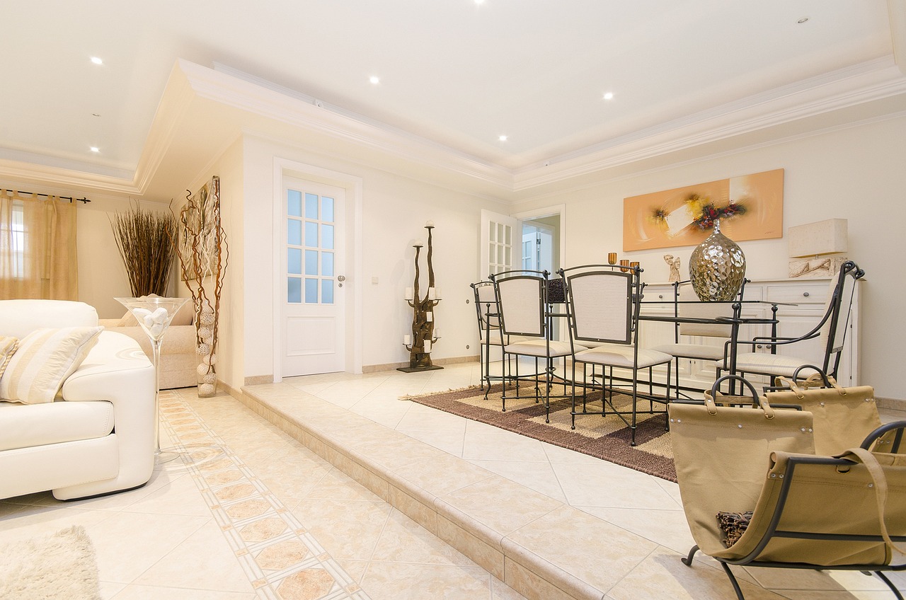
Neutral Tones: Timeless Elegance
Neutral colours like beige, gray, and white offer a versatile backdrop that complements various decor styles. These shades can create a sophisticated look, allowing you to play with textures and patterns without overwhelming the space.
Choosing the Right Shade of Grey
Grey is a popular choice for its adaptability. When selecting the perfect shade, consider the undertones; warm greys can create a cozy atmosphere, while cool greys offer a sleek, modern feel. Pair grey with soft textiles to enhance its warmth.
Benefits of Soft Beige Hues
Soft beige tones bring warmth and comfort to a bedroom. These hues can create a cozy atmosphere while maintaining a modern aesthetic. They work well with various accent colours, allowing for easy updates to your decor.
Bold and Bright Colours for a Statement
For those looking to make a statement, bold colours like royal blue, emerald green, and vibrant red can transform a bedroom. These colours can serve as focal points, drawing attention and creating a dramatic effect.
Combining Patterns and Textures with Colour
Mixing patterns and textures can enhance the visual appeal of your bed. For example, using patterned pillows or throws can add depth to a solid-coloured bed. Consider layering different materials like cotton, velvet, or linen to create a rich, inviting look.
Seasonal Bed Colour Trends
- Spring and Summer: Light and airy colours such as soft blues and whites can create a refreshing atmosphere.
- Autumn and Winter: Warm and cozy colours like deep oranges and browns can enhance comfort during the colder months.
Practical Tips for Choosing Bed Colours
Selecting the right bed colour requires careful consideration. Here are some practical tips:
- Assessing Your Bedroom’s Natural Light: Natural light plays a crucial role in how colours appear. A colour that looks great in daylight may seem different under artificial lighting.
- Considering Existing Decor Elements: Your bed should harmonize with existing decor. Take note of wall colours, furniture, and accessories to ensure a cohesive look.
By carefully considering these factors, you can choose a bed colour that not only enhances your bedroom’s aesthetic but also reflects your personal style. With the right hue, your bed can become a stunning centerpiece that ties your entire room together.

The Psychology of Bed Colours
Understanding how colours affect mood can significantly influence your choice of bed colour. The emotional impact of various hues is profound, as different colours can evoke specific feelings and atmospheres within a space. This section delves into the psychological effects of colour, offering insights into how to select the right shades for your bedroom.
Warm Colours: Inviting Energy
Warm colours such as red, orange, and yellow are known to generate feelings of warmth and energy. These colours can create a lively atmosphere, making them ideal for social spaces. However, when used in the bedroom, they might stimulate rather than soothe. If you choose a warm colour for your bed, consider pairing it with neutral tones to balance the energy and maintain a relaxing environment.
Cool Colours: Serene Calmness
In contrast, cool colours like blue, green, and purple promote a sense of calm and tranquility. Blue, in particular, is associated with feelings of peace and can lower heart rates, making it a popular choice for bedrooms. Green, reminiscent of nature, can evoke feelings of renewal and harmony, while purple adds a touch of luxury and creativity. Incorporating these colours into your bed design can help create a serene sanctuary.
Neutral Colours: Balanced Versatility
Neutral colours such as white, beige, and gray provide a versatile backdrop that can complement a variety of decor styles. These hues are often associated with simplicity and elegance, allowing for easy integration with other design elements. Choosing a neutral bed colour can also offer a sense of stability and calm, making it a safe choice for many homeowners.
Understanding Colour Combinations
It’s not just about selecting a single colour; the combination of colours can also impact the mood of your bedroom. For instance, pairing a bold colour with a softer hue can create a dynamic yet harmonious look. Consider using accent pillows or throws in contrasting colours to add visual interest while maintaining a cohesive design.
Impact of Lighting on Colour Perception
The way colours are perceived can change significantly based on lighting. Natural light can enhance the vibrancy of colours, while artificial lighting can alter their appearance. It’s essential to assess how your bedroom’s lighting interacts with your chosen bed colour. For example, a soft grey may appear warmer in the glow of a lamp, while in daylight, it may seem cooler. Testing colours in different lighting conditions can help you make a more informed decision.
Seasonal Colour Influences
Seasons can also inspire colour choices. In spring and summer, lighter, more vibrant colours can evoke feelings of freshness and renewal. In contrast, autumn and winter may call for warmer, cozier hues that promote comfort and relaxation. Adapting your bed colour to reflect seasonal themes can keep your space feeling current and inviting.
Personal Preferences and Cultural Associations
Your personal preferences and cultural background also play a significant role in how you perceive colour. Some individuals may find certain colours comforting based on their experiences, while others may associate colours with specific cultural meanings. Understanding your unique relationship with colour can guide you in selecting a bed colour that resonates with your personal style and emotional needs.
In conclusion, the psychology of bed colours is a valuable consideration when designing your bedroom. By understanding how different hues affect mood and atmosphere, you can make informed choices that not only enhance your space aesthetically but also contribute to your overall well-being.

Trendy Bed Colour Palettes for 2023
As we dive into 2023, the world of interior design continues to evolve, bringing fresh and exciting trends to the forefront. Among these, bed colour palettes are taking center stage, influencing the overall aesthetic of bedrooms across the globe. Staying ahead of the curve with the latest bed colour trends is essential for anyone looking to refresh their space. This section highlights popular palettes that are making waves in interior design this year.
- Earthy Tones: Embracing nature is a significant trend this year. Earthy colours such as terracotta, olive green, and sandy beige create a serene environment, promoting relaxation and harmony. These shades can be easily paired with natural materials like wood and linen, enhancing the organic feel of your bedroom.
- Deep Jewel Tones: For those wanting to make a bold statement, rich jewel tones like sapphire blue, emerald green, and ruby red are trending. These colours add depth and luxury to any bedroom, creating a sense of sophistication. Incorporating these hues through bed linens or accent pillows can transform your space into a lavish retreat.
- Soft Pastels: Soft pastel colours, including blush pink, mint green, and lavender, are perfect for creating a light and airy atmosphere. These gentle hues evoke a sense of calm and are ideal for bedrooms where relaxation is key. Pastels can easily be combined with white or light grey for a fresh, modern look.
- Monochromatic Schemes: Playing with shades of a single colour is another trend gaining popularity. Monochromatic palettes create a cohesive and harmonious look. For example, varying shades of grey or blue can be used in bedding, curtains, and wall colours to provide depth without overwhelming the space.
- Classic Black and White: The timeless combination of black and white remains a staple in interior design. This palette offers a striking contrast that can be both modern and elegant. Incorporating black accents, such as a headboard or decorative pillows, can add sophistication to a predominantly white room.
When selecting a bed colour palette, consider the overall mood you want to create in your bedroom. Each colour has its unique psychological impact, influencing how you feel in the space. For instance, earthy tones can ground you, while jewel tones may inspire creativity and energy.
Furthermore, the choice of bed colour should complement existing decor elements in your room. Assessing your bedroom’s natural light is also crucial, as colours can appear differently under varying lighting conditions. Soft colours may wash out in bright light, while darker shades can create a cozy ambiance in dimly lit spaces.
In conclusion, keeping up with the latest bed colour trends not only enhances the aesthetic appeal of your bedroom but also contributes to a positive atmosphere. By understanding the emotional impact of colours and thoughtfully selecting your palette, you can create a space that truly reflects your style and promotes comfort.
Neutral Tones: Timeless Elegance
When it comes to creating a serene and inviting bedroom environment, neutral tones such as beige, gray, and white stand out as timeless choices. These hues not only provide a versatile backdrop but also harmonize beautifully with various decor styles, from modern minimalism to classic elegance. In this section, we will explore how to effectively incorporate these shades into your bedroom design for a sophisticated look.
Neutral colours serve as a blank canvas, allowing other elements in your room to shine. For instance, a soft beige bedspread can create a warm and inviting atmosphere, while a cool gray headboard adds a touch of modern sophistication. To achieve a cohesive look, consider the following tips:
- Layering Textures: Combine different textures in neutral tones to add depth. For example, a plush white duvet paired with a knitted beige throw can create a visually appealing contrast.
- Accent with Colour: Use bold accessories, such as bright cushions or artwork, to add pops of colour against a neutral backdrop. This approach keeps your space lively without overwhelming the senses.
- Mixing Shades: Don’t hesitate to mix various shades of gray and beige. A palette that includes light taupe alongside charcoal can create an elegant gradient effect, enriching the overall design.
When selecting your neutral tones, consider the psychological impact they have on your space. Soft beige hues can evoke feelings of warmth and comfort, making them ideal for a relaxing bedroom. On the other hand, lighter grays can promote calmness and tranquility, perfect for unwinding after a long day.
Additionally, the choice of fabric can enhance the perception of these neutral colours. For instance, a silky white bedspread can reflect light beautifully, making the room feel more spacious, while a matte beige fabric can absorb light, creating a cozy nook. It’s essential to evaluate how different materials interact with your chosen shades.
Another critical aspect is the lighting in your bedroom. Natural light can significantly affect how these colours appear throughout the day. For rooms bathed in sunlight, cooler grays may help balance the warmth, while softer beiges can complement the glow of evening light. Consider using sheer curtains to diffuse harsh sunlight, allowing your neutral tones to shine without being washed out.
Finally, remember that incorporating neutral tones doesn’t mean your design has to be bland. The key lies in the thoughtful selection of decor elements, such as artwork, rugs, and furniture. A striking piece of art can serve as a focal point against a neutral wall, while a patterned rug can introduce visual interest, tying the room together.
In conclusion, embracing neutral tones like beige, gray, and white in your bedroom design can lead to an elegant and sophisticated atmosphere. By layering textures, mixing shades, and carefully considering your room’s lighting and decor, you can create a timeless space that feels both inviting and stylish.
Choosing the Right Shade of Grey
can be a daunting task, given the multitude of options available. Grey is a versatile colour that can complement various styles, from modern to traditional. This guide will help you navigate the selection process to find the perfect shade that enhances your existing decor.
Firstly, consider the undertones of grey. Grey can have warm, cool, or neutral undertones, which significantly influence how it interacts with other colours in your space. For example, a grey with warm undertones, such as taupe or greige, pairs beautifully with earthy tones and wooden furniture. On the other hand, cool greys, which have blue or green undertones, can create a more contemporary feel and work well with sleek, minimalist designs.
- Assess Your Existing Palette: Take a close look at the colours already present in your room. If your decor features warm colours, lean towards warmer greys. For cooler palettes, select greys with blue or green undertones.
- Test Samples: Always test paint samples on your walls. Lighting can drastically change the appearance of a colour, so observe how the grey looks at different times of the day.
- Consider the Size of Your Space: Lighter shades of grey can make a small room feel larger and more open, while darker greys can create a cozy, intimate atmosphere.
Another crucial factor is the finish of the paint. A matte finish can provide a soft, understated look, while a satin or glossy finish can add a touch of elegance and sophistication. Consider the overall vibe you want to achieve in your bedroom when selecting the finish.
Furthermore, incorporating texture can enhance the grey’s visual appeal. Pairing grey walls with textured fabrics, such as velvet or linen, can create depth and interest in your decor. Accessories like cushions, throws, and rugs in complementary colours can also help tie the room together.
When selecting a shade of grey, don’t forget to think about the lighting in your bedroom. Natural light can make greys appear lighter and more vibrant, while artificial lighting can cast different hues. It’s advisable to observe your chosen grey under various lighting conditions to ensure it meets your expectations.
Ultimately, the right shade of grey should resonate with your personal style while harmonizing with your existing decor. By taking the time to evaluate undertones, test samples, and consider the overall atmosphere you want to create, you can confidently choose a grey that enhances your space.
In summary, grey is a fantastic choice for any bedroom, offering versatility and sophistication. By following these tips and being mindful of your decor and lighting, you can find the perfect shade of grey that will elevate your bedroom’s aesthetic.
Benefits of Soft Beige Hues
Soft beige tones are increasingly becoming a popular choice for bedroom decor, offering a perfect blend of warmth and comfort. These hues not only create a cozy atmosphere but also maintain a modern aesthetic that appeals to a wide range of tastes. In this section, we will explore the various benefits of incorporating soft beige hues into your bedroom design.
- Creates a Calming Environment: Soft beige shades evoke a sense of tranquility, making them ideal for a space dedicated to relaxation. The gentle tones can help reduce stress and promote a peaceful atmosphere, essential for a good night’s sleep.
- Versatile Pairing: Beige is a neutral color that seamlessly blends with other colors and patterns. Whether you prefer bold accents or subtle pastels, soft beige can serve as an excellent backdrop that enhances the overall decor.
- Enhances Natural Light: Soft beige tones reflect light beautifully, which can make your bedroom feel brighter and more spacious. This quality is particularly beneficial in smaller rooms or those with limited natural light.
- Timeless Appeal: Unlike trendy colors that may fall out of fashion, soft beige offers a classic look that withstands the test of time. This makes it a wise investment for long-term decor.
- Warmth in All Seasons: Soft beige hues can provide warmth during the colder months while remaining light and airy in the summer. This versatility allows you to maintain a cozy atmosphere year-round.
- Easy to Accessorize: The neutral nature of beige makes it easy to accessorize with various textiles, such as throws, cushions, and curtains. You can easily change the look of your bedroom by swapping out accessories without needing to repaint or replace large furniture pieces.
When choosing soft beige for your bedroom, consider the various shades available. From creamy off-whites to deeper taupes, the range of beige tones can cater to different preferences and styles. Pairing soft beige with textures like linen, cotton, or wool can further enhance the cozy feel of the space.
Incorporating soft beige hues into your bedroom decor not only elevates the aesthetic but also creates a welcoming and serene environment. By choosing this versatile color, you are setting the stage for a modern yet timeless sanctuary that reflects your personal style while providing comfort and warmth.
Bold and Bright Colours for a Statement
For those looking to make a statement, bold colours such as royal blue, emerald green, and vibrant red can dramatically transform a bedroom. These hues are not just visually striking; they also carry a psychological impact that can elevate the overall mood of your space. In this section, we will explore how to effectively use these colours to create a stunning bedroom atmosphere.
When incorporating bold colours into your bedroom, consider the following strategies:
- Accent Walls: One of the most effective ways to introduce bold colours is through an accent wall. Painting one wall in a striking hue can serve as a focal point, drawing attention and adding depth to your room. For instance, a royal blue accent wall can create a serene yet powerful backdrop for your bed.
- Textiles and Accessories: If painting walls feels too permanent, consider using textiles to introduce bold colours. Vibrant bed linens, throw pillows, and curtains in emerald green can add layers of colour without overwhelming the space. These elements can be easily changed as trends evolve.
- Artwork and Decor: Incorporate bold colours through artwork or decorative items. A large painting featuring vibrant red can energize the room and tie together the colour scheme. Look for pieces that resonate with your personal style while complementing your chosen hues.
- Combining with Neutrals: To balance the intensity of bold colours, pair them with neutral tones. For example, a white or grey bed frame can soften the look while allowing the bold colours to shine. This combination creates a harmonious environment that feels both vibrant and inviting.
It’s important to remember that the psychological effects of colours can influence how we feel in our space. Royal blue is often associated with calmness and tranquility, making it an excellent choice for a restful atmosphere. Emerald green symbolizes growth and renewal, perfect for creating a refreshing retreat. Meanwhile, vibrant red can evoke feelings of passion and energy, which may be ideal for a lively and dynamic bedroom.
When selecting bold colours, consider the lighting in your bedroom. Natural light can enhance the vibrancy of these hues, while artificial lighting may soften their impact. It’s advisable to test paint samples in different lighting conditions to see how they change throughout the day.
In conclusion, bold and bright colours can serve as powerful tools in bedroom design. By thoughtfully incorporating hues like royal blue, emerald green, and vibrant red, you can create a space that reflects your personality while also providing a stimulating environment. Whether through paint, textiles, or decor, these colours can help you make a statement that is both stylish and impactful.

Combining Patterns and Textures with Colour
When it comes to designing your bedroom, combining patterns and textures with colour can significantly elevate the overall aesthetic. This section focuses on how to layer different elements to achieve a cohesive and visually appealing look.
Mixing patterns and textures is not just about throwing together different fabrics; it involves a thoughtful approach that considers balance and harmony. To create a stunning bed design, start by selecting a dominant colour that resonates with your personal style. Once you have established your base colour, you can explore various patterns and textures that complement it.
- Choose a Focal Point: Begin with a statement piece, such as a patterned duvet cover or a textured throw blanket. This will serve as the foundation for your design.
- Layering Techniques: Use different textures, such as cotton, linen, or velvet, to create depth. For example, pair a soft cotton sheet with a plush velvet throw to enhance the tactile experience.
- Mixing Patterns: When combining patterns, aim for a mix of scales. For instance, if your duvet cover features large floral prints, consider using a smaller geometric pattern for your pillows. This contrast will add visual interest without overwhelming the senses.
Another key element to consider is the colour palette. Stick to a cohesive colour scheme that ties everything together. You might choose a monochromatic palette, where varying shades of the same colour create a serene effect, or opt for a complementary palette that combines contrasting colours for a bolder statement.
Textures also play a crucial role in how we perceive colour. A smooth satin finish can make a colour appear more vibrant, while a matte fabric may soften it. Experiment with different materials to see how they affect the overall look of your bed. For example, a chunky knit blanket can add warmth and coziness, while a sleek silk pillowcase offers a touch of luxury.
Don’t forget about the importance of accessories. Incorporating decorative elements such as cushions, throws, and bed skirts can further enhance your design. Choose accessories that echo the patterns and textures used in your bedding to create a harmonious look. For instance, if your duvet cover has a bold stripe, consider adding striped or patterned cushions in complementary colours.
Finally, remember that balance is essential. Too many patterns can create a chaotic look, while too few can make the design feel flat. Aim for a balanced mix that feels intentional and curated. A good rule of thumb is to use a maximum of three different patterns and to ensure that they share a common colour or theme.
In conclusion, combining patterns and textures with colour is an art that requires careful consideration and creativity. By selecting a dominant colour, layering different textures, and mixing patterns thoughtfully, you can create a bed design that is both cohesive and visually appealing. Embrace the process, and don’t be afraid to experiment until you find the perfect combination that reflects your unique style.
Using Patterns to Complement Bed Colour
Patterns can serve as a fantastic tool to enhance the aesthetic appeal of your bed and overall bedroom design. When chosen thoughtfully, they can add depth and interest to your space, transforming a simple bed into a focal point. However, the key lies in selecting patterns that harmonize with your chosen bed colour.
To begin with, it’s essential to understand the relationship between colour and pattern. A well-coordinated design can elevate the mood of your bedroom, creating a harmonious environment. Here are some tips to help you select patterns that complement your bed colour:
- Consider the Colour Wheel: Familiarize yourself with the colour wheel to understand complementary and analogous colours. For instance, if your bed is adorned in a soft blue, consider patterns that incorporate shades of blue, green, or even a contrasting orange to create visual interest.
- Choose Patterns That Reflect Your Style: Whether you prefer floral, geometric, or abstract patterns, select designs that resonate with your personal style while harmonizing with the bed colour. For example, a bold geometric print can make a striking statement against a neutral bed.
- Layering Textures: Incorporating different textures can enhance the patterns you choose. A soft, textured throw blanket can add a layer of warmth to a patterned duvet cover, making the bed more inviting.
- Balance is Key: If your bed colour is bold, opt for subtle patterns to avoid overwhelming the space. Conversely, if your bed is in a muted tone, feel free to experiment with bolder patterns to create a captivating contrast.
When selecting patterns, it’s also important to consider the scale of the design. Large patterns can dominate the space, while smaller patterns can provide a more delicate touch. For instance, if your bed is a deep burgundy, a small floral pattern in shades of pink and cream can create a lovely balance, adding a touch of softness without competing with the dominant colour.
Additionally, think about how patterns can be layered. Mixing different patterns can lead to a dynamic and visually appealing design. For example, pairing a striped bedspread with a floral pillow can create a delightful contrast, provided the colours are complementary. This layering technique can bring a sense of cohesion and interest to your bedroom.
Lastly, don’t forget the impact of lighting on how patterns and colours appear in your space. Natural light can enhance the vibrancy of patterns, while softer lighting can create a more subdued effect. Always consider how the patterns will look in different lighting conditions throughout the day.
In conclusion, selecting patterns that complement your bed colour involves a thoughtful approach to colour theory, personal style, and an understanding of texture and scale. By incorporating these elements, you can create a beautifully designed bed that not only enhances your bedroom’s aesthetic but also reflects your personal taste.
Textures that Enhance Colour Perception
When designing your bedroom, textures play a crucial role in how we perceive colour. Different materials can dramatically alter the overall aesthetic of your bed and, consequently, your entire room. This section explores various textures and their influence on colour perception, helping you make informed choices for a harmonious bedroom design.
Understanding how textures interact with colours can transform your space. For instance, a soft velvet bedspread may appear richer and deeper in hue compared to a crisp cotton fabric. The way light reflects off these different materials can create varying visual effects, enhancing or muting the colours you choose.
| Texture | Colour Perception | Best Uses |
|---|---|---|
| Velvet | Rich and luxurious | Formal settings, statement pieces |
| Cotton | Fresh and vibrant | Casual, everyday use |
| Linen | Natural and muted | Relaxed, bohemian styles |
| Silk | Elegant and soft | Luxury bedrooms, romantic themes |
Additionally, incorporating a variety of textures can create a more dynamic and visually appealing space. For example, pairing a smooth satin duvet cover with a knitted throw adds depth and interest, allowing the colours to interact in unique ways. The contrast between the smooth and textured surfaces can enhance the overall colour scheme, making it more engaging.
- Layering Fabrics: Combining different textures, such as a plush throw on a cotton bedspread, can create a cozy atmosphere while enhancing colour depth.
- Accent Pillows: Use pillows in varying fabrics—like silk and linen—to introduce subtle colour variations that catch the eye.
- Bed Frames: The material of your bed frame, whether it’s wood, metal, or upholstered, can also influence how the bed’s colour is perceived in the room.
Furthermore, consider the lighting in your bedroom when selecting textures. Natural light can bring out the vibrancy of colours, while artificial lighting may alter their appearance. For instance, a textured fabric may look different under warm incandescent light compared to cool LED lighting. Experimenting with various light sources can help you determine how textures and colours work together in your space.
In summary, the interplay between textures and colours is vital for creating a cohesive and aesthetically pleasing bedroom. By thoughtfully selecting materials and layering them in your design, you can enhance the overall colour perception and elevate the visual appeal of your bed. This strategic approach not only enriches your personal style but also contributes to a more inviting and comfortable atmosphere.

Seasonal Bed Colour Trends
are an essential aspect of interior design, as they allow homeowners to reflect the changing moods and themes of each season through their bedroom decor. By adapting bed colours according to the seasons, you can create a harmonious and inviting atmosphere that enhances your overall living space. This section will explore how to effectively incorporate seasonal colour palettes into your bedroom design.
As the weather warms up, the desire for light and airy colours becomes prevalent. Spring is a time for renewal, making it the perfect opportunity to introduce soft pastels and vibrant hues into your bedroom. Consider shades like soft pinks, pale yellows, and mint greens that evoke feelings of freshness and vitality. These colours can be used in bed linens, pillows, and even accent walls to create a tranquil yet lively environment.
- Pastel Blue: Reminiscent of clear skies, this colour promotes calmness and relaxation.
- Peach: A warm and inviting shade that adds a touch of cheerfulness.
- Lavender: Known for its soothing properties, lavender can create a serene sleeping space.
As the days grow shorter and temperatures drop, it’s time to shift to warm and cozy hues that foster comfort and warmth. Autumn brings rich shades like deep oranges, burgundies, and earthy browns that can evoke the feeling of a cozy retreat. These colours can be complemented by heavier fabrics like flannel or velvet, enhancing the sense of warmth in your bedroom.
- Rust: A deep, warm tone that pairs beautifully with natural elements.
- Mustard Yellow: Adds a pop of brightness while still feeling earthy and grounded.
- Forest Green: This shade brings the essence of nature indoors, promoting relaxation.
Transitioning between seasonal colours doesn’t have to be a daunting task. Start by investing in versatile bed linens that can easily be swapped out as the seasons change. For example, a neutral base can serve as a backdrop for seasonal accents, allowing you to refresh your bedroom’s look without a complete overhaul.
In addition, consider incorporating seasonal decor elements such as throw pillows, blankets, and artwork that reflect the colours of the season. This approach allows for easy updates while maintaining a cohesive look throughout the year.
Understanding the psychological effects of colour can also guide your choices. Lighter colours in spring and summer can uplift your mood and energize your space, while warmer tones in autumn and winter can create a sense of security and comfort. By being mindful of how colours influence emotions, you can curate a bedroom that not only looks beautiful but also feels inviting and restful.
Incorporating seasonal bed colour trends into your bedroom design allows you to create a dynamic and inviting atmosphere that evolves throughout the year. By selecting colours that resonate with the changing seasons, you not only enhance the aesthetic appeal of your space but also foster a sense of comfort and well-being. Embrace the beauty of seasonal changes and let your bed reflect the vibrant moods of nature.
Spring and Summer: Light and Airy Colours
As the seasons transition into spring and summer, many homeowners look to refresh their living spaces, particularly their bedrooms. One of the most effective ways to achieve a vibrant, rejuvenating atmosphere is through the use of light and airy colours. These shades not only evoke a sense of calm and tranquility but also reflect the natural beauty of the warmer months. In this section, we will explore the best colour choices for spring and summer, how to incorporate them into your bedroom design, and the emotional impact they can have on your overall mood.
When selecting colours for spring and summer, consider hues that are soft and inviting. Pastels such as pale pinks, soft blues, and mint greens can create a serene atmosphere that mirrors the beauty of blooming flowers and clear skies. These colours are not only visually appealing but also promote a sense of relaxation and contentment.
In addition to pastels, incorporating shades of white and light neutrals can enhance the feeling of spaciousness in your bedroom. Off-whites and light beiges can act as a perfect backdrop for more vibrant accents, allowing you to play with different textures and patterns without overwhelming the space. These hues reflect natural light, making your room feel brighter and more open.
While light colours are essential for creating a refreshing atmosphere, don’t shy away from adding a few bold accents to your design. Consider incorporating cushions, throws, or artwork in vibrant shades like coral or turquoise. These accents can energize your space and bring a lively touch to the overall aesthetic.
The choice of materials can significantly impact how colours are perceived in your bedroom. Light, airy fabrics such as linen and cotton not only complement light colours but also contribute to a breezy feel. Layering different textures can create depth and interest without compromising the light and airy theme. For instance, a soft linen duvet paired with a light cotton throw can create a cozy yet refreshing look.
To further enhance the spring and summer vibe, consider adding seasonal decor elements. Fresh flowers, light curtains, and nature-inspired artwork can all contribute to a lively atmosphere. Incorporating these elements allows you to celebrate the season while keeping your bedroom feeling fresh and inviting.
Choosing the right colours can have a profound impact on your mood. Light and airy colours are known to promote feelings of happiness and relaxation, making them ideal for a space dedicated to rest and rejuvenation. By surrounding yourself with these shades, you can create an environment that fosters peace and tranquility, helping you to unwind after a long day.
In conclusion, embracing light and airy colours during the warmer months can significantly enhance your bedroom’s atmosphere. From soft pastels to bright accents, these hues can transform your space into a refreshing retreat. By carefully selecting colours and incorporating complementary textures and decor elements, you can create a harmonious environment that reflects the beauty of spring and summer.
Autumn and Winter: Warm and Cozy Hues
As the chill of autumn and winter settles in, creating a warm and inviting atmosphere in your bedroom becomes essential. The right colour palette can transform your space into a cozy retreat, perfect for those colder months. This section explores the best warm and cozy hues that can enhance comfort and style in your bedroom decor.
Warm colours, such as deep reds, rich oranges, and soft yellows, evoke feelings of comfort and safety. These hues can make your bedroom feel more intimate and welcoming, fostering a sense of relaxation. When selecting colours for your bed, consider how they resonate with your personal style and the overall ambiance you wish to create.
- Rustic Red: This shade brings a touch of warmth and richness, reminiscent of autumn leaves. Pair it with neutral bedding for a balanced look.
- Golden Yellow: A golden hue can brighten up the dreary winter days, adding a cheerful touch to your bedroom.
- Earthy Brown: Shades of brown create a grounding effect, making your space feel cozy and connected to nature.
- Soft Taupe: This versatile colour works beautifully with other warm tones, providing a sophisticated backdrop for your decor.
- Warm Grey: A warm grey can serve as a neutral base, allowing you to layer in other warm accents without overwhelming the space.
In addition to colour, layering different textures can enhance the cozy feel of your bedroom. Consider incorporating materials such as plush throws, soft quilts, and velvet cushions. These elements not only add depth but also contribute to a tactile experience that invites relaxation.
While warm colours dominate the autumn and winter palettes, incorporating accent colours can elevate your design. Consider using deep greens or navy blues as accents to create a striking contrast against warm tones. These colours can be introduced through decorative pillows, artwork, or even a statement rug.
- Seasonal Bedding: Switch out your bedding for seasonal patterns that reflect autumn leaves or winter snowflakes.
- Wall Art: Choose artwork that features warm tones or seasonal themes to tie your decor together.
- Candles and Lighting: Soft lighting and candles can add to the warm atmosphere, making your bedroom feel even cozier.
When selecting warm colours for your bedroom, consider the following:
- Test Samples: Always test paint samples on your walls to see how they look in different lighting throughout the day.
- Balance with Neutrals: Pair warm colours with neutral tones to prevent the space from feeling overwhelming.
- Personal Preference: Ultimately, choose colours that resonate with you and create a space where you feel comfortable and relaxed.
By thoughtfully selecting warm and cozy colours, along with complementary textures and accents, you can create a serene retreat in your bedroom that reflects the beauty of the autumn and winter seasons.

Practical Tips for Choosing Bed Colours
Selecting the right bed colour requires careful consideration. The bed is often the focal point of the bedroom, making its colour choice crucial for achieving a cohesive and inviting atmosphere. This section offers practical advice to help you make informed decisions that align with your style.
When deciding on a bed colour, it’s essential to consider the overall theme of your bedroom. Are you aiming for a serene and calming space, or do you prefer a vibrant and energizing environment? Here are some practical tips to guide you:
- Assess Your Room’s Lighting: The amount of natural light in your bedroom significantly influences how colours appear. Rooms with ample sunlight may benefit from cooler tones, while dimly lit spaces can be enhanced with warmer shades. Observe how your chosen colour looks at different times of the day.
- Evaluate Existing Decor: Take stock of your current furnishings, wall colours, and decorative elements. Your bed colour should harmonize with these components. For instance, if your walls are painted in a soft pastel, a bed in a complementary hue can create a seamless look.
- Consider the Size of Your Space: Dark colours can make a room feel smaller, while lighter shades can open up the space. If you have a compact bedroom, consider opting for lighter tones to create an illusion of space.
- Think About Your Personal Style: Your bed should reflect your personal taste. If you lean towards a minimalist aesthetic, neutral colours like white, beige, or grey can be ideal. Conversely, if you enjoy bold designs, consider striking colours like deep blue or rich burgundy.
- Explore Colour Psychology: Different colours evoke different emotions. For instance, blue is often associated with tranquility, while red can stimulate energy and passion. Choose a colour that resonates with the mood you want to cultivate in your bedroom.
Additionally, it can be helpful to create a mood board. This visual representation can assist in determining how various colours and textures will work together in your space. Gather paint swatches, fabric samples, and images that inspire you. This process can clarify your vision and guide your decision-making.
Another practical tip is to test your chosen colour before committing. Purchase a small sample of paint or fabric and place it on your bed or wall. Observe how it interacts with your room’s lighting and decor over a few days. This simple step can save you from potential dissatisfaction.
Finally, don’t hesitate to seek professional advice. Interior designers can offer insights tailored to your space and help you navigate colour choices effectively. Their expertise can provide you with a fresh perspective and innovative ideas.
In summary, selecting the right bed colour is a multifaceted decision that requires thoughtful consideration of various elements, including lighting, existing decor, personal style, and colour psychology. By following these practical tips, you can create a harmonious and visually appealing bedroom that reflects your unique taste.
Assessing Your Bedroom’s Natural Light
When it comes to designing your bedroom, one of the most critical factors to consider is natural light. The way light interacts with different colours can significantly affect the overall ambiance and feel of your space. Understanding how to assess your bedroom’s natural light is essential for selecting the perfect bed colour that complements your decor and enhances your mood.
Why Natural Light Matters
Natural light can change the perception of colour throughout the day. In the morning, the light is often cooler and can make colours appear more vibrant, while in the evening, the light may take on a warmer hue, softening the appearance of colours. This fluctuation can influence how you perceive your bed colour, making it crucial to evaluate the light conditions in your bedroom.
Evaluating Your Bedroom’s Light Source
- Window Orientation: The direction your windows face will determine how much natural light your bedroom receives. South-facing rooms typically get the most light, while north-facing rooms can be darker and cooler.
- Time of Day: Observe how the light changes at different times of the day. Morning light is often bright and crisp, while late afternoon light can be softer and warmer.
- Seasonal Variations: The intensity and quality of natural light can change with the seasons. In summer, longer days mean more light, whereas winter can bring shorter, dimmer days.
Testing Your Colour Choices
Once you understand your bedroom’s light conditions, it’s time to test your bed colour options. Here are some practical steps:
- Swatch Test: Paint a small section of your wall or use fabric swatches in your chosen colours. Observe how they look at different times of the day.
- Lighting Effects: Use a combination of natural and artificial lighting to see how your colour choices change under different light sources.
- Consider Sheen: The finish of your bed fabric can also impact how colour is perceived. Glossy finishes reflect more light, while matte finishes absorb it.
Choosing the Right Bed Colour Based on Light Assessment
After evaluating your bedroom’s natural light, you can make an informed decision about your bed colour. Here are some recommendations:
- Bright and Airy Spaces: If your room receives ample natural light, consider using soft pastels or bright colours to enhance the airy feel.
- Cozy and Warm Ambiances: For bedrooms with less natural light, opt for warm tones like soft beiges or earthy browns to create a welcoming atmosphere.
- Bold Statements: If you’re looking to make a statement, choose bold colours like deep blues or rich greens that can stand out even in lower light conditions.
In conclusion, assessing your bedroom’s natural light is a fundamental step in selecting the right bed colour. By understanding how light interacts with colours at various times of the day and throughout the seasons, you can create a harmonious and inviting space that reflects your personal style.
Considering Existing Decor Elements
When it comes to designing your bedroom, the bed is often the focal point of the space. Therefore, it is essential that your bed harmonizes with the existing decor to create a cohesive and inviting atmosphere. In this section, we will explore practical tips on how to effectively coordinate your bed colour with other design elements in your room, ensuring a stylish and balanced aesthetic.
- Evaluate Your Color Palette: Start by assessing the overall colour scheme of your bedroom. Identify the dominant hues used in your walls, furniture, and accessories. This will serve as a foundation for selecting a bed colour that complements rather than clashes with the existing decor.
- Choose Complementary Shades: Once you have a clear understanding of your colour palette, look for bed colours that are either complementary or analogous. For instance, if your room features warm tones like terracotta and mustard, consider a bed in a soft cream or muted peach to maintain harmony.
- Incorporate Accent Colours: If your bedroom has a few accent colours, such as in throw pillows or artwork, think about incorporating these shades into your bed design. A bold pop of colour in your bedding or a statement headboard can tie the room together and add visual interest.
- Consider the Style of Your Decor: The style of your existing decor—be it modern, rustic, or eclectic—should influence your choice of bed colour. For example, a sleek, contemporary room may benefit from a bed in a deep navy or charcoal, while a bohemian space might call for a vibrant patterned bedspread.
- Textures Matter: In addition to colour, consider the textures present in your room. A bed covered in soft linens can soften the look of a room dominated by hard surfaces, while a plush velvet headboard can add a touch of luxury to a minimalist space.
- Lighting Effects: Remember that lighting can significantly affect how colours appear. Evaluate your room’s natural and artificial lighting to choose a bed colour that looks appealing in various lighting conditions throughout the day.
- Personal Preference: Ultimately, your personal taste should guide your decision. Choose a bed colour that resonates with you and makes you feel comfortable and relaxed in your space.
By following these tips, you can ensure that your bed not only serves as a functional piece of furniture but also enhances the overall aesthetic of your bedroom. A well-coordinated bed colour can create a sense of unity in your decor, making your bedroom a true sanctuary.
Frequently Asked Questions
- What bed colours are best for a calming atmosphere?
For a calming atmosphere, consider soft hues like light blue, soft green, or gentle beige. These colours promote relaxation and can help create a serene environment in your bedroom.
- How do I choose a bed colour that matches my existing decor?
Start by assessing the dominant colours in your room. Look for shades that either complement or contrast effectively with your decor. Using a colour wheel can help you find harmonious pairings!
- Are bold colours suitable for small bedrooms?
Absolutely! Bold colours can add personality to small spaces. Just be sure to balance them with neutral tones or light fabrics to avoid overwhelming the room.
- How can I incorporate patterns with my bed colour?
Mixing patterns is all about balance. Choose one main pattern for your bed linens and complement it with solid colours that pick up tones from the pattern. This creates a cohesive look!
- What seasonal colours should I consider for my bed?
In spring and summer, opt for light and airy colours like pastels. For autumn and winter, go for warm and cozy hues like deep reds or rich browns to create a snug atmosphere.


